Tradezella
Fintech SaaS Analytics UI UX Design | Trading Journal Platform

Overview
TradeZella is a professional trading journal built for serious traders, a platform that brings together trade logging, performance analytics, and behavioral insights into a single ecosystem, so traders can stop guessing why they're losing and start understanding exactly how they trade.
The product had already carved out a strong position in the market with a loyal user base and a powerful feature set. But power and usability rarely arrive together. When I came onto the project, the product was at a critical inflection point, it had grown fast, features had accumulated, and the experience had started to buckle under its own weight. The interface was dense, the onboarding dropped users into deep water with no guide, the journal felt like a chore, and the analytics, arguably the most valuable part of the entire product, were being ignored because they were simply too hard to read.
My job was a full UX revamp: not to reinvent what TradeZella was, but to finally make it feel as intelligent as it actually is. That meant rebuilding the experience from the very first screen a new user sees, all the way through to the dashboard a professional trader lives in every single day across both web and mobile.
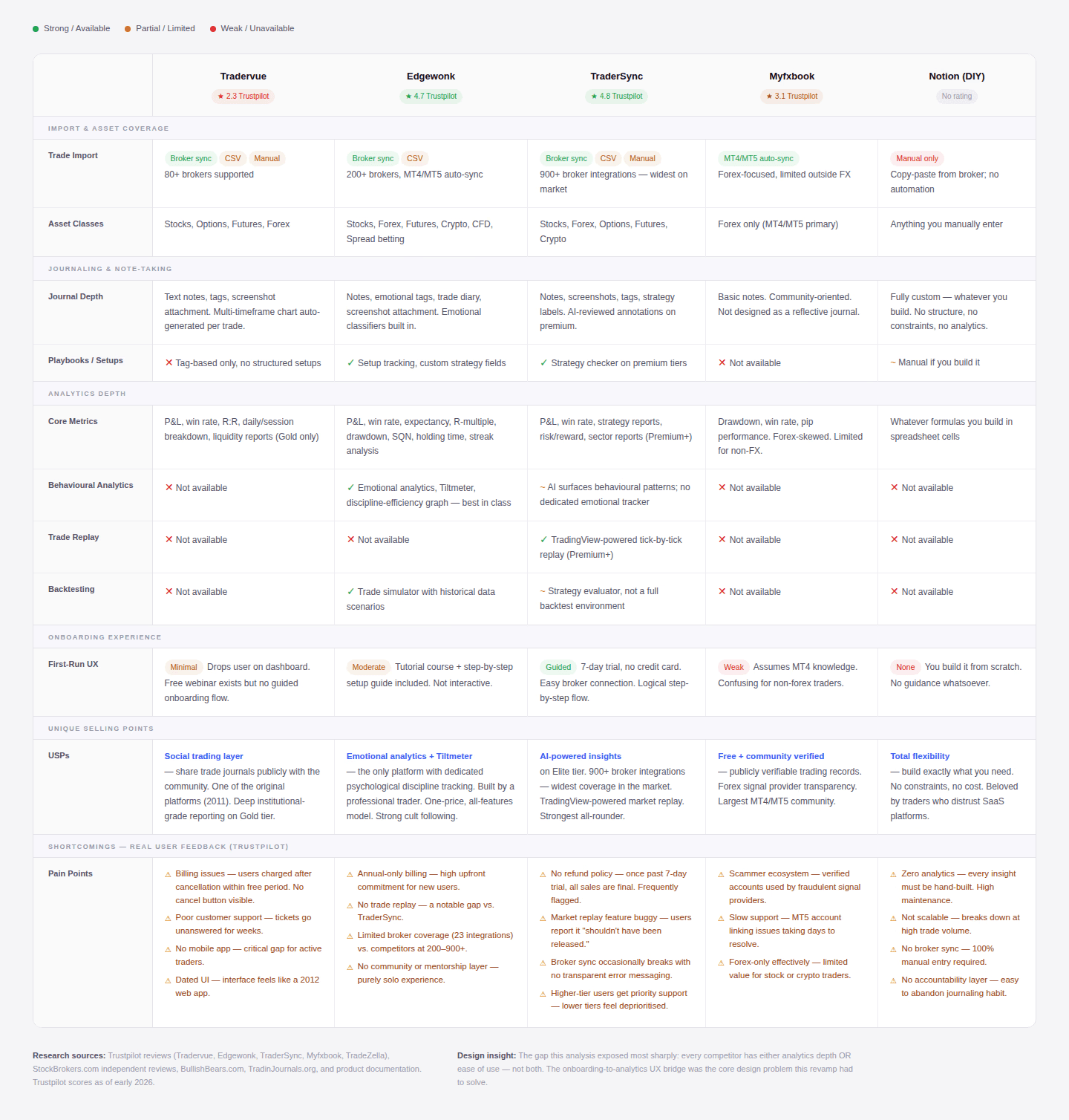
Competitor Analysis
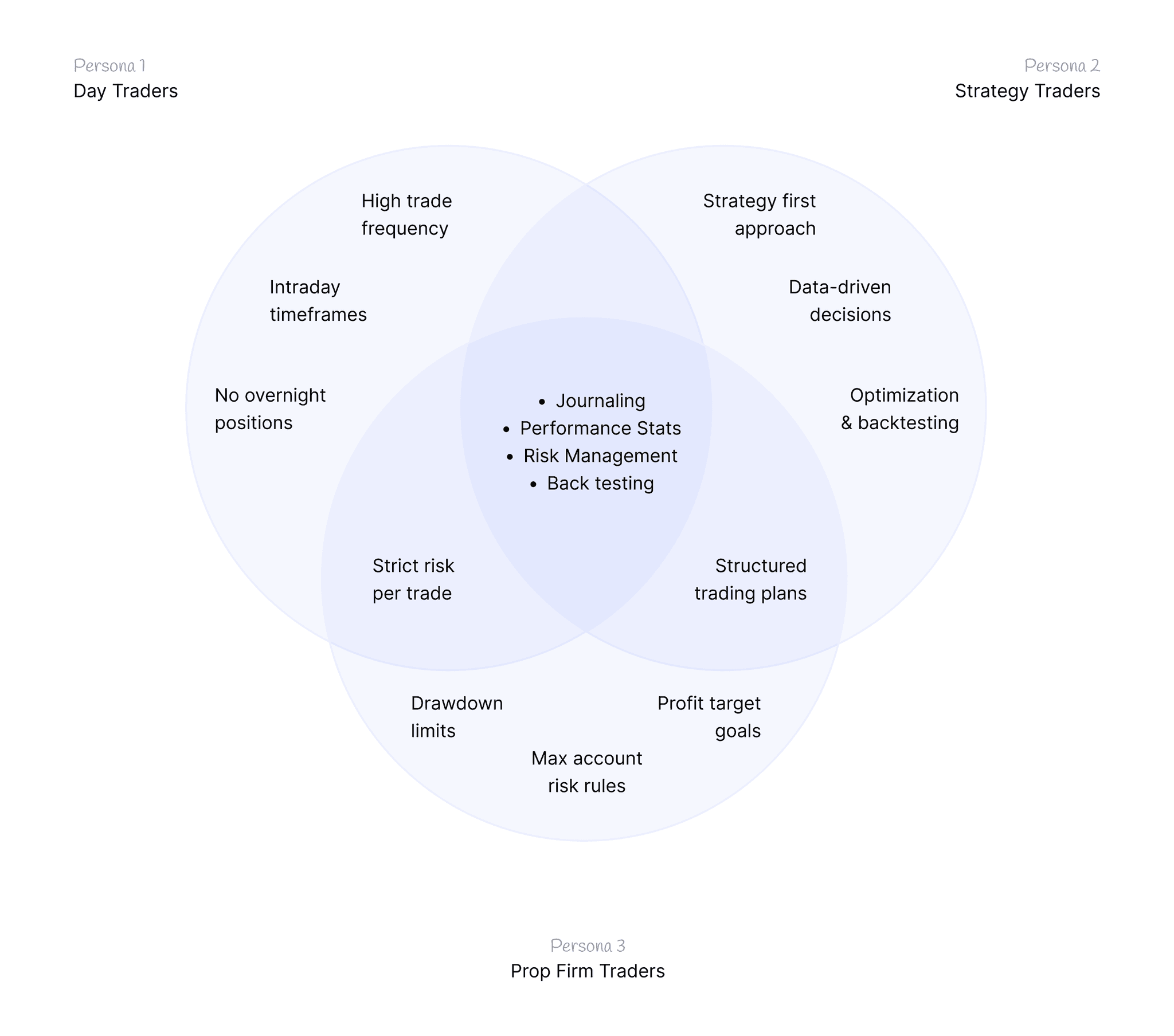
User Persona
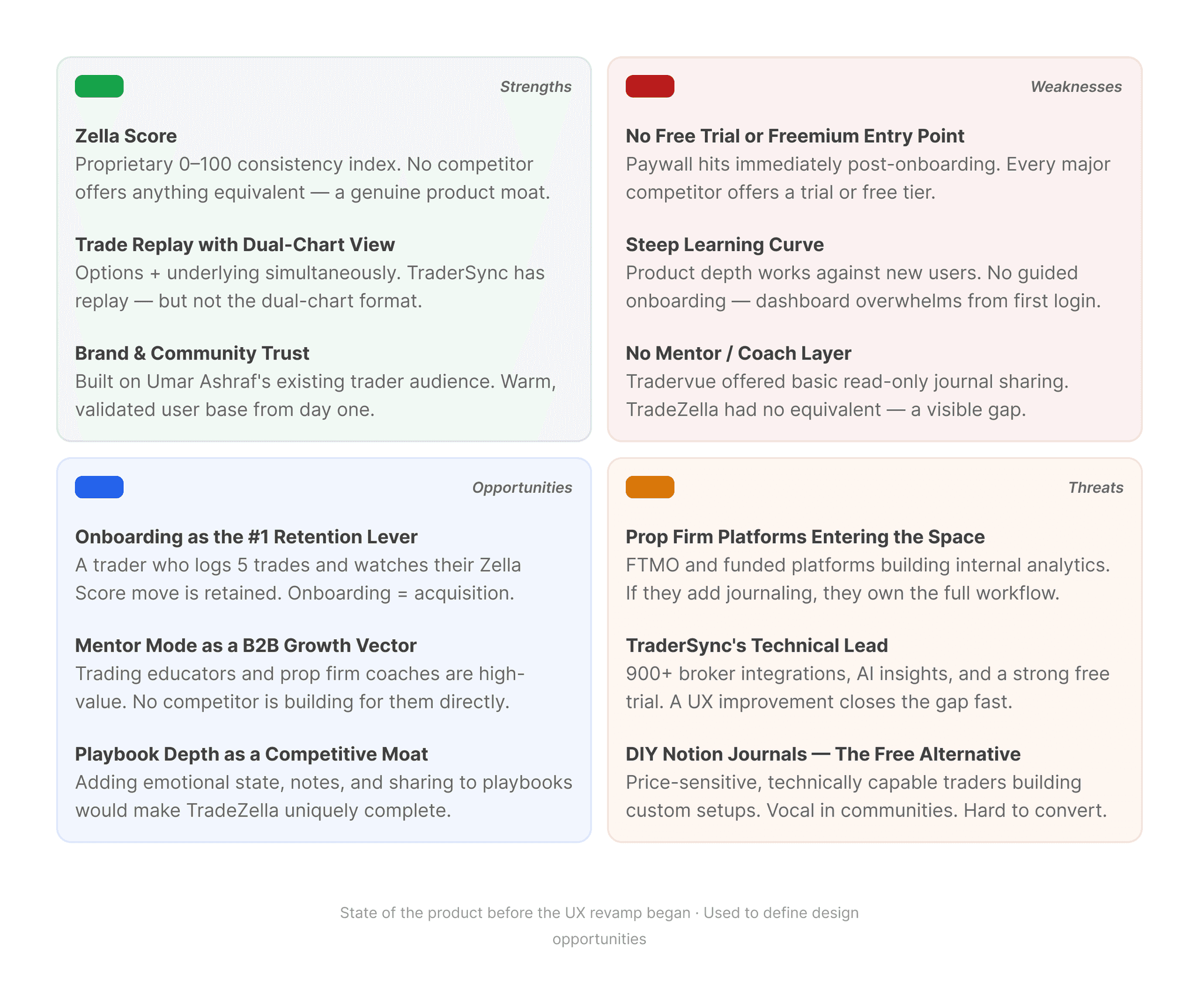
SWOT Analysis
The competitive analysis showed us what the market was doing. The personas told us who we were designing for. The SWOT connected both and revealed where TradeZella had the most to gain and the most to lose.
Problem Statement
TradeZella had built something genuinely impressive, a comprehensive trading journal with deep analytics, backtesting, replay, and a scoring system no competitor could match. But the experience of using it told a different story.
The interface had grown dense with features that competed equally for attention, leaving traders unsure of where to look or what to do first. New users arrived with no orientation, no guided path, no progressive introduction to the product's depth, no moment that made the value obvious before they were expected to navigate it alone. And for traders switching between desktop and mobile, the inconsistency created a fractured mental model that quietly eroded trust.
The core problem wasn't what TradeZella could do. It was that too few traders could actually feel it working.
Goals and KPIs
The revamp was anchored to four outcomes. Every screen, every flow, every decision made during this project maps back to one of them.
The first goal was to declutter the interface without sacrificing depth. TradeZella's power was never in question, but power without hierarchy is noise. The interface needed clear visual priority so traders could orient instantly, understand what mattered most, and access advanced features without being ambushed by them upfront.
The second goal was to eliminate the learning curve through guided onboarding. No product survives a bad first impression, and TradeZella was giving new users one of the hardest feature-dense dashboard with no orientation and no moment that made the value tangible before demanding independent exploration. The onboarding needed to earn trust early enough to keep traders in the product long enough to see what it could do.
The third goal was to make the dashboard analytics the centrepiece the founders always intended. The data existed. The Zella Score existed. The reports existed. None of it was being used at the rate it deserved because nothing told traders where to look first or what to do with what they found. Data needed to guide behaviour, not just display it.
The fourth goal was to close the gap between web and mobile. Traders analyse on desktop and log on mobile, often in the most time-pressured moments of their day. The mobile experience felt like a shrunken desktop with no adaptation for a fundamentally different context. Rebuilding it around the specific moments traders actually use it meant the product could finally follow them through their entire day.
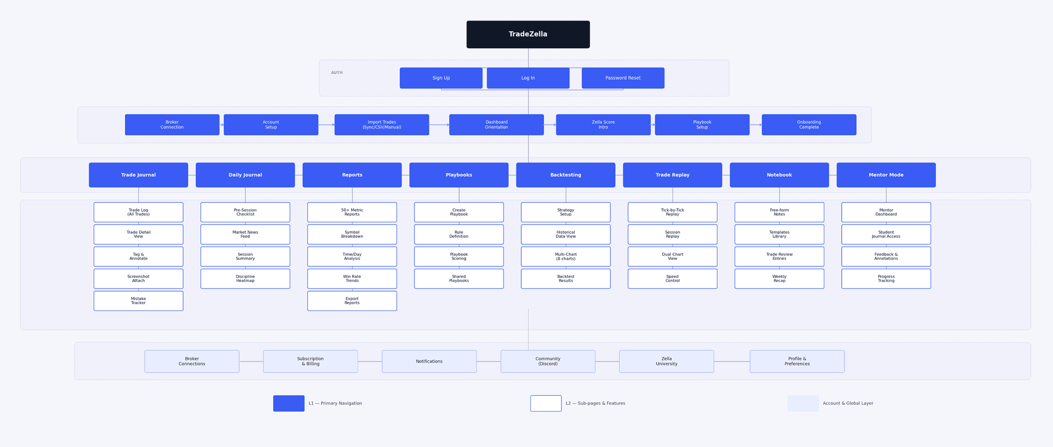
Information Architecture
Module Feature List
After conducting the competitive analysis, defining the user personas, and mapping the information architecture carefully against real trader behaviour, the following module list was finalised. Every feature on this list earned its place by directly serving a validated user need. Everything that didn't was deliberately deprioritised — keeping the experience focused rather than exhaustive.
- Dashboard
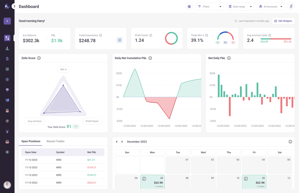
- The product's centrepiece. Rebuilt around Zella Score as the primary anchor, with performance overview, P&L calendar, account switcher, and customisable widgets.
- Daily Journal
- A pre and post-session layer built around trader discipline. Pre-session checklist, market context notes, session summary, and discipline heatmap, building consistency as a habit.
- Playbooks
- Traders define strategies as rules, score themselves trade by trade, and share playbooks within their network.
- Trade Replay
- Tick-by-tick session replay with dual-chart view (options + underlying simultaneously). Designed for post-session review with the emotional distance live trading doesn't allow.
- Notebook
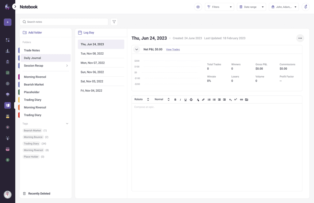
- Free-form writing space for trade reviews, weekly recaps, and personal notes. Supported by a templates library to give traders a starting point without constraining their thinking.
- Mentor Mode
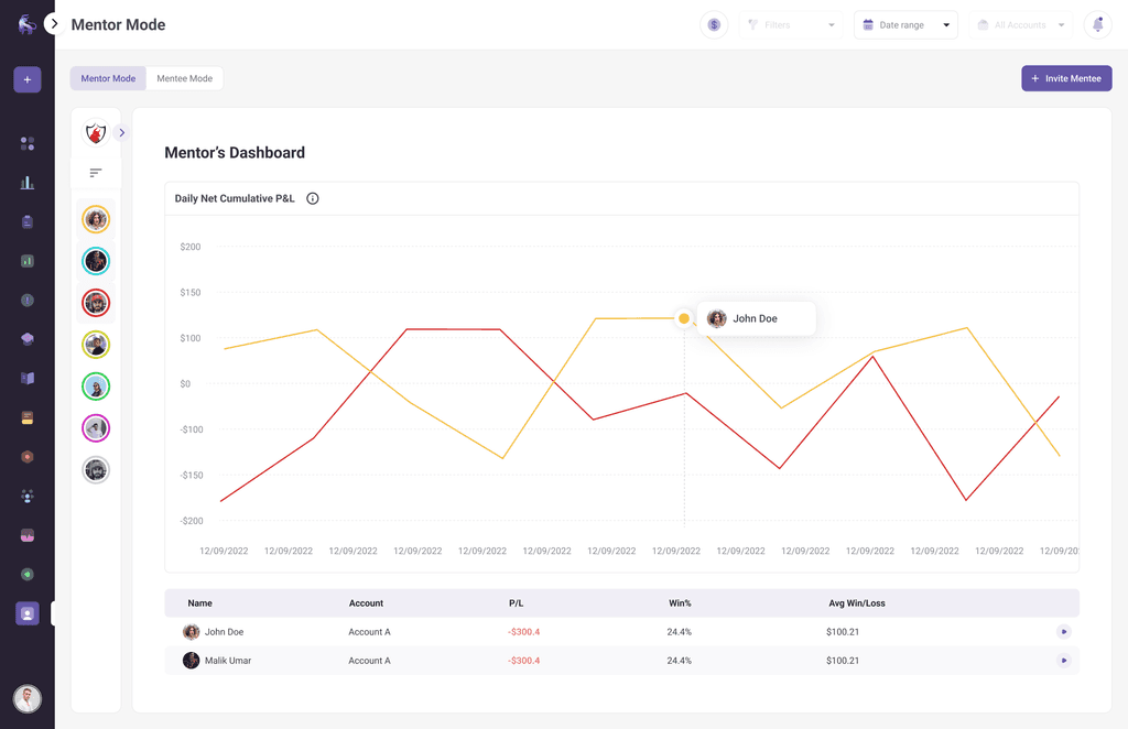
- A dedicated coach-student layer introduced during the revamp. Mentors get journal access, annotation capability, and student progress tracking, turning TradeZella from a solo tool into a shared learning environment.
Wireframes
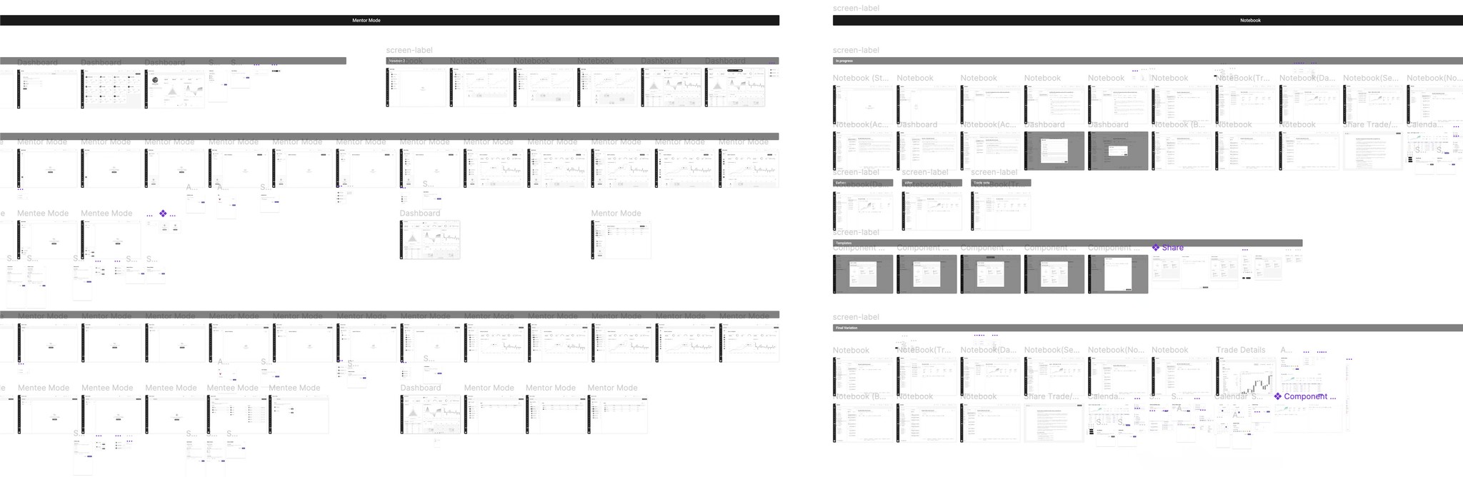
I began by developing wireframes alongside user flows to ensure all necessary screen components were accounted for. The wireframes were then prototyped to run cognitive walkthroughs, allowing the design to be iterated and validated before moving to high-fidelity mockups.
High fidelity mockups
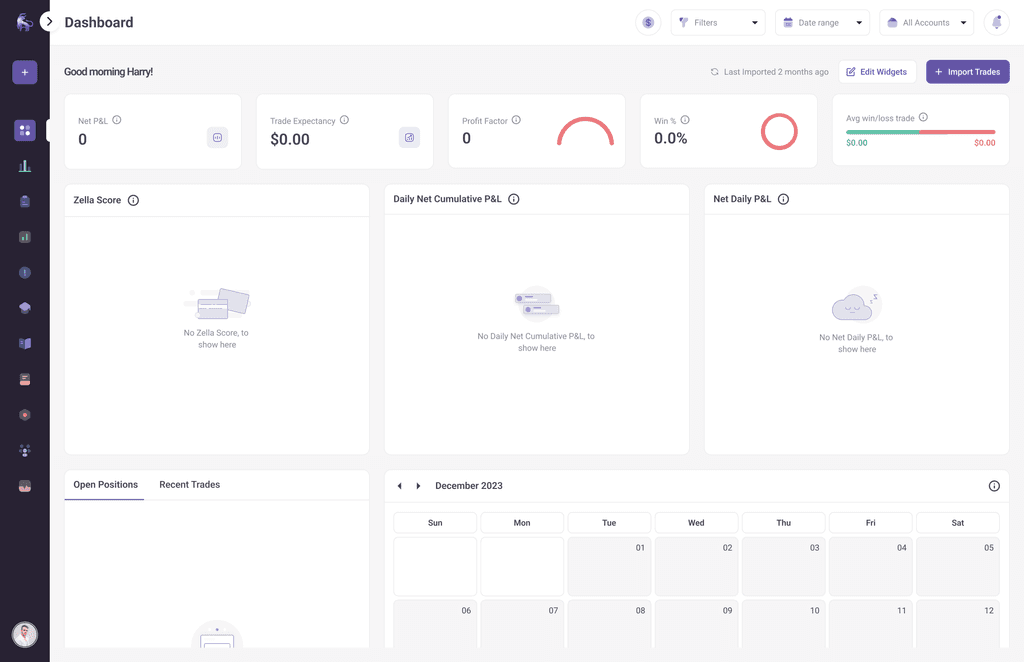
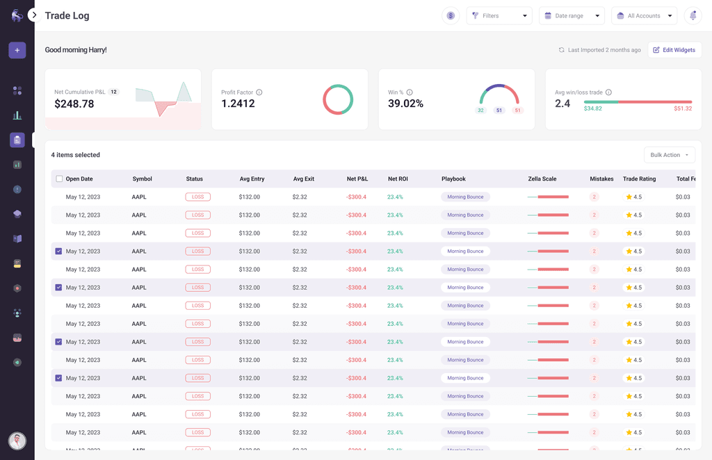
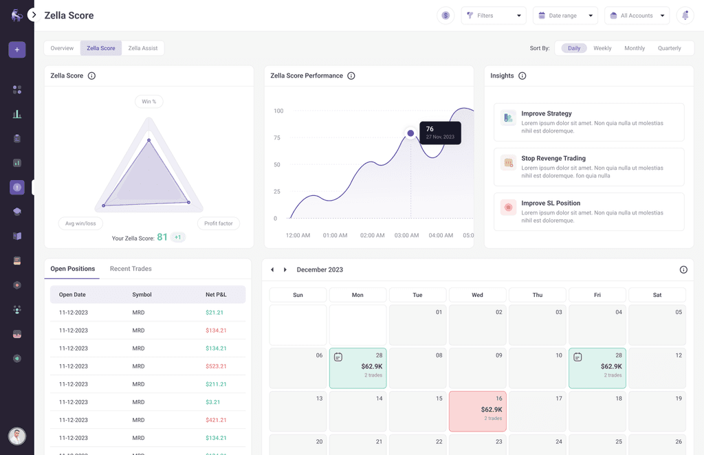
These're the result of every research session, every design argument, and every decision made in service of one goal: making TradeZella feel as powerful as it actually is.
End-user feedback
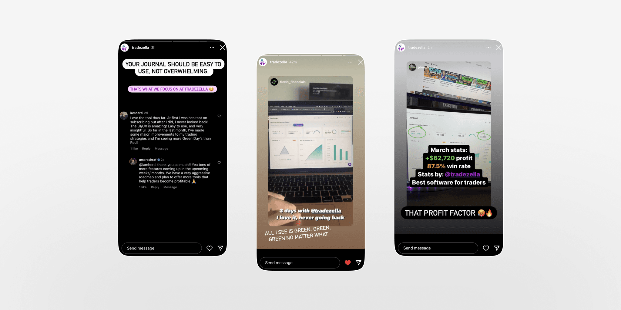
The most honest measure of any design isn't what the team thinks of it, it's what end users (traders) say when nobody asked them to. These are unprompted comments from real TradeZella users, shared publicly on Instagram. No brief, no incentive, no prompt. Just traders who noticed the difference and said so.
Ending Notes
Revamping TradeZella taught me that the hardest design problems aren't the ones with no solution but they're the ones where the solution already exists inside the product, buried under the weight of accumulated decisions made without a user in the room.
The revamp wasn't about reinvention. It was about excavation, stripping back the noise, finding what TradeZella was genuinely brilliant at, and building an experience that both a first-time trader and a seasoned professional could navigate without feeling like the product was built for someone else.